The Anti-AI Trend in Branding

In January this year, Vogue gave Ariana Grande the finger. Literally, an extra one. Six in total, casually attached to the hand of one of the most photographed women on the planet.
The internet, as it does, took notice. Because this wasn’t a quick banner ad or half‑asleep social post. It was a global publication with layers of taste and committees of approval. Who missed that, and how?
The AI branding problems are piling up and we’re seeing them everywhere from high-end photography and packaging to campaigns and branding.
In this vacuum, craft is becoming the new marker of credibility.
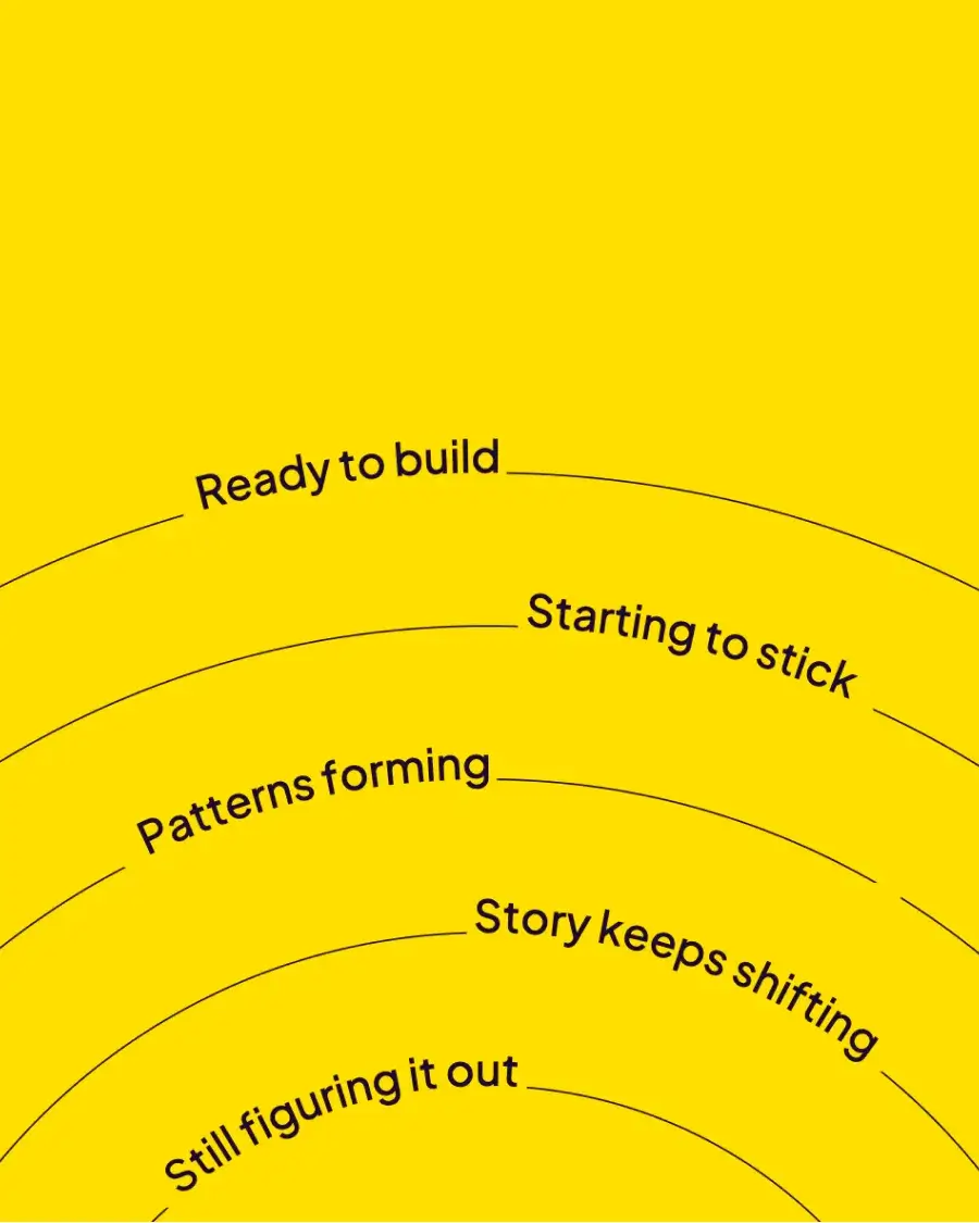
The drift toward sameness
Six fingers is an obvious tell of AI gone awry. But one of the more subtle AI generated branding risks is an aesthetic convergence that happens not because the work is awful, but because it’s so risk-averse it doesn’t register.
There’s an accelerating sameness in the tone of branding across industries, especially in sectors where brand identities should be sharpest.
Take the fintech industry, for example. What was once positioned as a radical alternative to traditional banking has settled into a familiar pattern of gradients, glossy lifestyle photography, minimalist layouts, and a vaguely rebellious tone of voice. Every new launch arrives looking something like the last, resulting in a genre of brands that feel increasingly interchangeable.
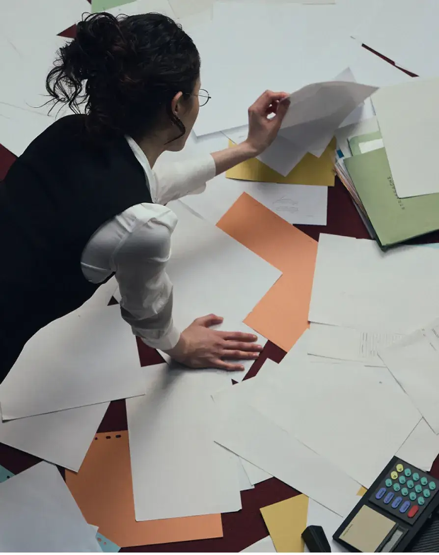
Whether human-made or machine-assisted, work that skips the hard questions in favour of what feels safe tends to blur into the background. Differentiation takes time. Despite the leaps in technology, there’s still no shortcut for process. The strongest brands don’t—and never have—come from speed or consensus.
They came from moments of friction: an unexpected reference, an overlooked piece of data, or something said in a meeting that didn’t make it into the brief. Try as some might, but you can’t prompt your way to that.
What’s actually premium now
Our industry has spent years treating speed as a virtue. Faster delivery. Faster iteration. Faster approval. But the speed vs. taste tension is starting to expose something deeper: when everything is fast, the thing that stands out is what took time.
You can see it in the return of hand-drawn illustration systems. Type design moving back toward custom letterforms and interesting ligatures, especially in sectors like hospitality, food, and fashion, where sameness kills trust. You also see it in photography that resists polish and leans into film grain or offbeat lighting. In identity and campaign work, this instinct shows up as a preference for more considered processes.
When we worked alongside our collaborators, OK Yes Please, on relaunching the photography and film studio Cala, the goal was to create a brand that felt understated and human. The branding system is anchored by a soft ligature, earth-toned colours, and unobtrusive typography, while our work on leading the website translated that into a digital environment that feels calm and editorial.

You can see a similar approach elsewhere. OpenAI’s recent rebrand could have leaned into AI visual tropes, but instead, it delivered something that felt human. Outside of tech, brands like Heineken, Cadbury, and Polaroid are openly rejecting AI in favour of in-person campaigns because the alternative is too easy for audiences to ignore.
At a time when every brand has access to the same design tools and prompts, the true differentiator is how and why you use them.
Where we stand
We use AI at Immo Studio. Of course we do. We don’t live in caves. We like tech. We like shiny new things. Use AI to tidy, test, and move things along quicker than we otherwise could? Absolutely.
But that’s where we draw the line, because we’ve seen what happens when you automate the parts of the process that are supposed to hold meaning. Often, AI brand voice issues don’t show up right away. At first, the brand voice sounds fine. But over time, without human input, the tone starts to drift and brand voice consistency starts to erode.
It’s the same with visual identity. Some brands might scrape by with an AI-generated logo, but a brand is much more than a logo. A brand is a system that gets tested on packaging, social, signage, merch, and more. There need to be clear links between the logo and the wider design language, because what works on an investor deck won’t always work on an app icon. Good logos take a lot of unseen work to make sure they’re robust and can handle different environments, sizes, and materials.
That’s why the process still matters. Strategy still matters. Good old thinking and the occasionally head-against-the-wall work of pushing past the first idea still matters.
In a time when every brand has access to the same tools, the real value lies in what happens before the work: the strategic groundwork, human input, and the taste and experience to make sound decisions. That’s still the part only people can do.
Why are some brands stepping back from AI-generated creative?
Does using AI always make branding feel generic?
What signals quality in branding right now?
Can AI replace brand strategy?
How are studios using AI responsibly in branding?